"Maintain detailed critically reflective records"
The drawings I made this morning are quite figurative - they are preliminary, sketchy drawings and I quite like how abstract they are.


However, it is not just the shapes that I am interested in: I also wanted to show the texture of the petals in more detail, to compare to the texture of skin.
I decided to try and draw some detailed drawings of flowers which show the fragility of the petals by softening the lines that I was drawing with.


While I like some of these drawings, I think I need to change media - pencil is too static to communicate the subtleties in colour and texture of these flowers.
Tomorrow, I will work in watercolour to try and demonstrate these subtleties. It might be interesting to make my own inks out of flowers to paint with, using the flowers themselves in the drawing of them.
In my first drawings of the day (below), I liked the fragility of the blue flowers - they look quite ethereal. The use of watercolour really helps the sense of translucency of the petals. However, I was concerned by the prettiness and obviousness of the watercolour: they look like something my grandma would approve of.


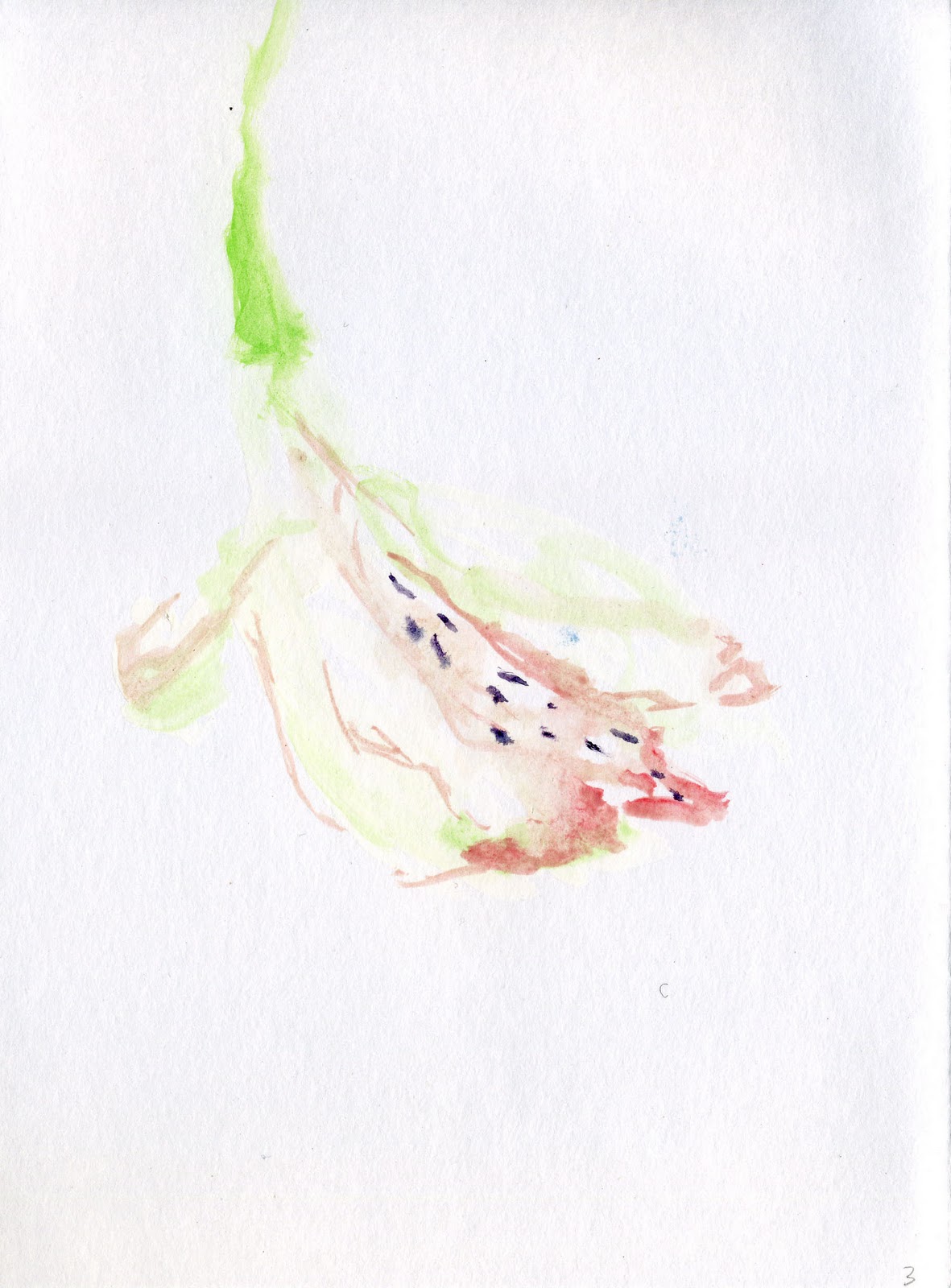
They did look a little like the veins in my wrists though, and so I decided to try and emphasise the abstract shapes of the flowers in the next few watercolours I made.
I think that the pink flowers resemble the curve of a back or the shapeliness of a thigh.
I tried to find ways of depicting the pink flowers so that they echo the shapes of bodies.
These paintings are more effective: when abstracted, the lines take on other forms.
I can see a neck and shoulders in the first blue watercolour (below), which is similar to one of my life class drawings.


This painting (below) could be a seated figure, or a kneecap:


While in this piece I can see a bent leg.


Maybe tomorrow I can experiment in photoshop to layer the watercolours over my life drawings.
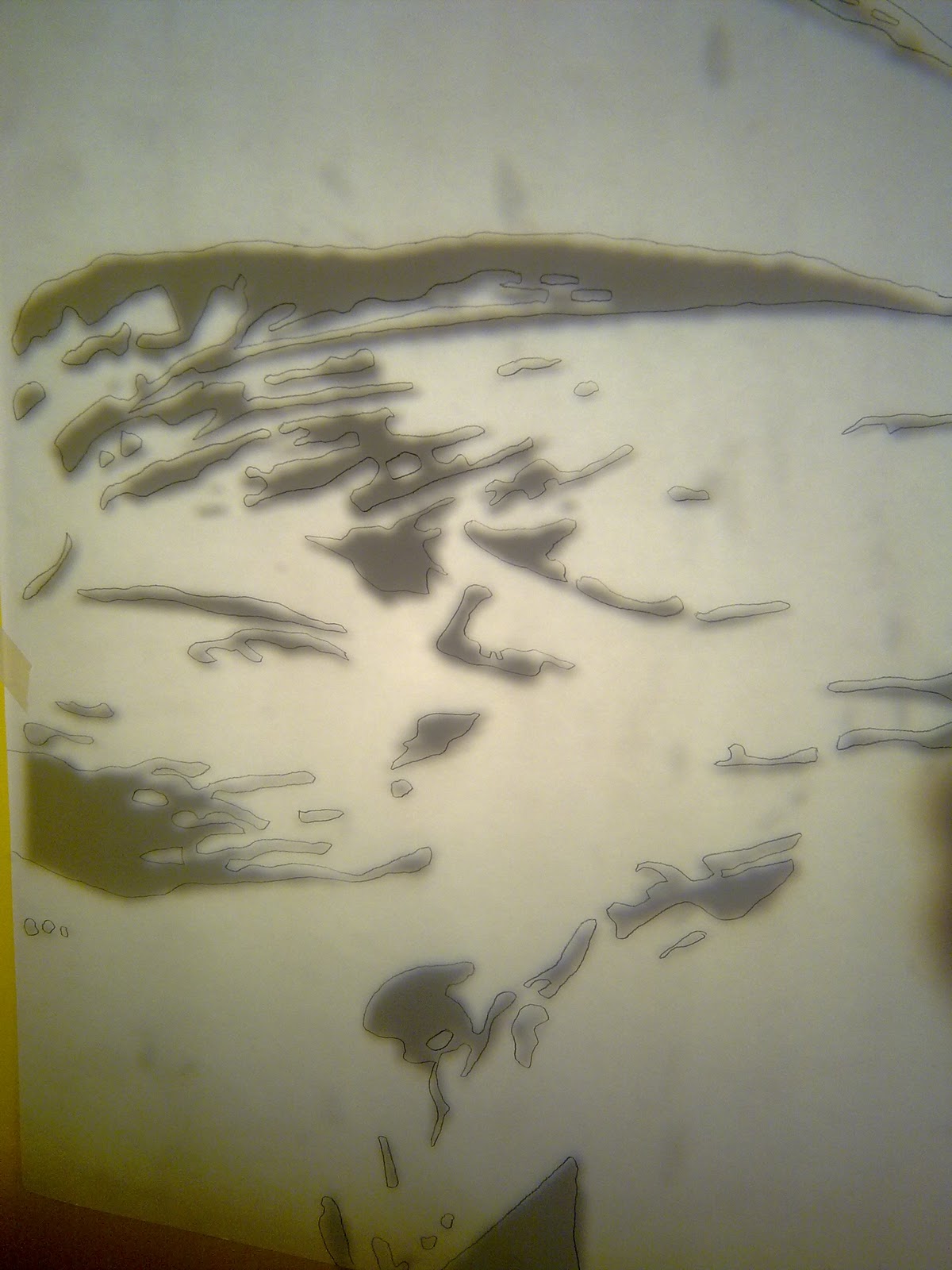
I haven't been able to access Photoshop yet, so until then I have some rudimentary examples of the flower drawings layered over the life drawings that are simply print outs of each onto tracing paper:


I really like how abstract the forms become when taken out of context: particularly the image of the knee, as the form has become unclear. While not hugely technological, I actually really like the effect of the layered paper, which creates a certain sort of shadow in the image. These images remind me of Kiki Smith's Woman with Bird series (see "Context" tab), where she layers drawings of birds over a female face.
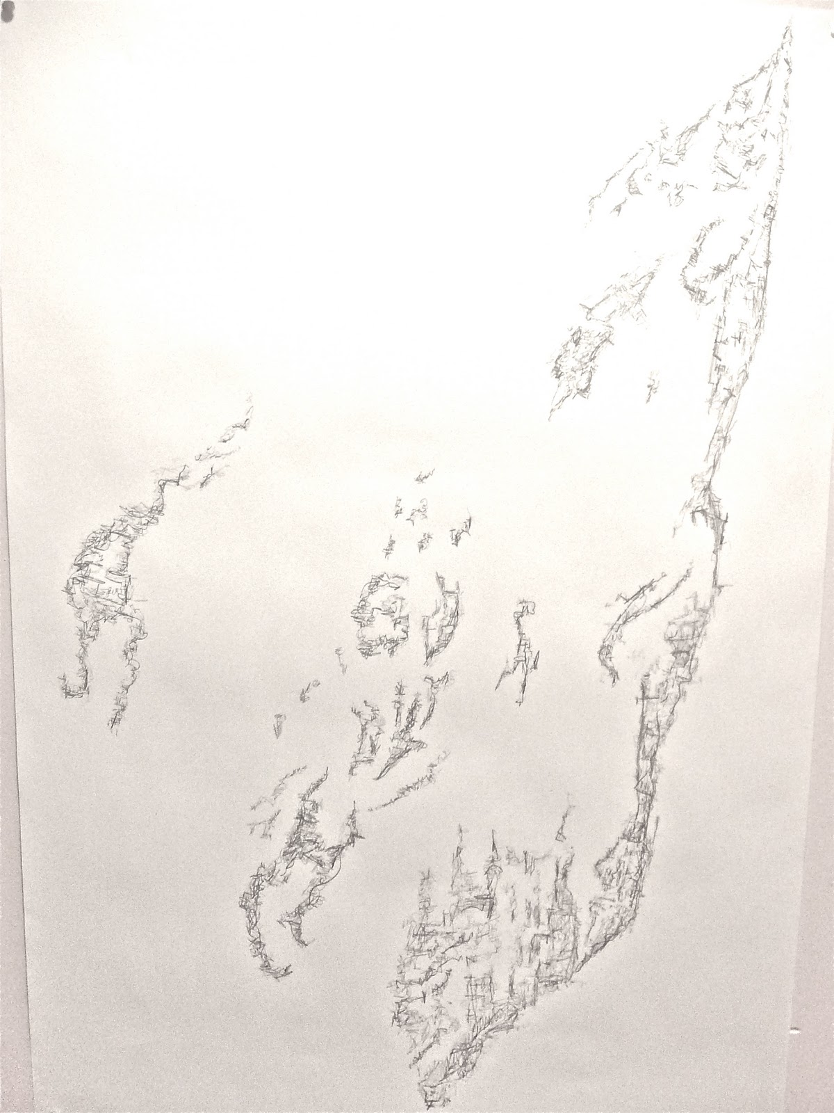
Returning to the idea that, when taken out of context, body parts can become abstracted, I am reminded of some body prints that I made a few weeks ago using graphite powder:


These hand prints have become less bodily and more fluid and ephemeral as I have turned my hand on the page, sweeping away familiar shapes.
The grid of lines in my skin is like a fabric weave. This morning I can see makeup settled into the wrinkles of my hand where I used it as a palette earlier today. I think that this grid is interesting, and I wonder if I should use the thicker, more defined lines in my hand for drawing? Perhaps if I simplify the lines I am working with, using only my life line, heart line etc, I can make a more interesting drawing.


This drawing reminds me of Melissa McGill's wall drawing, The Shadow of Ecstasy (see "Context" tab), where McGill has transcribed Bernini's sculpture Ecstasy of Saint Theresa by taking the shadows of Theresa's cloak out of context - reducing the shapes into an abstract form which she places directly onto the wall in black rubber.
I am pleased with the abstraction of this small drawing, and I will find ways to abstract flower images into purer shapes like McGill has.


This is the original image I was working from, a scan of a flower:

This is the image after I used Photoshop to convert it to black and white.

And here is the final image on acetate, cleaned up on Graphic Converter and ready to project.

By projecting this image, I can enlarge it to A1 size, removing the flower context, which comparatively is very small.


The above images show the process of projecting and drawing the image. I really like the use of graphite pencil compared to the original digital image, because with pencil there is a handmade, tactile quality which lacks in the digital version. In pencil, my hands can make mistakes, press harder or softer and smudge lines. I want my work to have this quality about it, as I am interested in bodies and particularly hands and their relationship to flowers.
This next piece shows the same process of projection - this time, however, my subject was the lines and wrinkles in the palm of my hand.


I think that this final image is more overt as to what it depicts - it's hard to detach myself and consider how it might look to an outsider, but I think that we are so familiar with our own bodies that we know this form, quite literally, as we know the back of our hand(!) This isn't necessarily a bad thing, but I think I prefer the less concrete flower image because it is such a bizarre shape.
The colour blocking of the pencil lines is beginning to frustrate me - not only because of the time each piece is taking, but also because of the infantile scratchy pencil lines which occur when colouring in a large area with pencil. I still want to use graphite pencil, because of the reasons I listed before (it's tactile and very hand-held aspects), but I think I will have to find a new way of drawing with it that helps the outcome be more visually dynamic.
This is the next drawing I made - using another scan of a flower as a guide for the shapes I wanted to make, I began this criss-cross cross hatch style drawing: this is a technique I sometimes use in Life drawing, and I wondered what different things it could convey when used for drawings of flowers.
As I was working, it was drawn to my attention that my lines were looking all too similar to each other, because I was only using one kind of pencil. It is true that if you look back at the early drawings I made of flowers (see "Flower Drawing" tab), the most interesting ones are the ones that have variation in softness and hardness of line. I began using different tones of pencil, and the finished drawing seems even sculptural because of the depth it now has.


Next, I attempted a similar, flower drawing (see below). I tried to create a process by which I could create future drawings, by beginning with a bare skeleton, and building up texture by adding layers of different pencils.


By the time I got to this point, I felt that the drawing lacked somewhat in comparison to the previous one, lacking in texture. By making a sort of outline around the shapes already made, I think I achieved the texture I wanted.

Below is the final drawing and close-ups:


I decided I wanted to make another drawing like this, but this time using my hand as a subject. The marks in the piece below are the marks on my creased palm. This time, I specifically used a harder pencil for the lighter, or less obvious lines in my palm, reserving the softer pencils for the deep ridges of my life, head and heart lines.


The next drawing I made is similar to the previous - I recycled the image of my hand which I used to project onto paper, and have drawn it in this style instead. I prefer this version, here there are subtleties which I missed in the earlier version; in tone and texture. In the other version, I complained that the subject was too overt, but now I think it has the intangible quality that the other drawings have.


These drawings have been reminding me of maps: the horizontal and vertical lines remind me of Kathy Prendergast's city drawings (see "Context" tab) and could be buildings and roads. This grid-formation is also reminiscent of the grid in my own skin made of tiny creases and lines. With this in mind, I want to "map" my hand by drawing the lines and creases in it.


I really like this drawing, although it didn't turn out to be quite as map-like as I had originally wanted. These lines remind me of projections - when you use an overhead projected to project a print on a sheet of acetate, these concentric circles project onto the wall as well as your image. In my last project it reminded me of the hoop of a fingerprint, and I love the way that the lines spindle off into nothing. I also really like how this drawing could allude not only to skin, but also to strands of hair, or even arteries and veins.
The next drawing I made is following up on these concentric lines, similarly to Louise Bourgeois's etching (see "Context" tab) - here I drew the deepest creases I had on my palm, and have joined them with skinny lines.


I am extremely proud of this piece, partially because it took hours of patience to complete. I would love to make a large scale drawing like this for my final piece, but I honestly believe I wouldn't get it finished in time for the final show. Perhaps in the future I will be able to accomplish this dream drawing. The final show is drawing ever closer, and I am still not sure what I want to do for my final piece. At the moment, I am worried that I am losing track of my original concept which is very much about transfiguration and metamorphoses from human to flower - I need to find a way of documenting this in the styles of drawing that I have been investigating.
This next drawing is returning to the idea of "mapping": I have drawn streets and buildings into main lines which represent the lines in my hand.
I have been complimented on this piece a lot at college, but I don't know if I like it. This piece is quite visually interesting, and plays with the notions of perspective, but I think it is a step backwards in my investigation. Perhaps this notion of mapping in such a literal way is a whole other area of investigation which I should return to in a later project - but for now, I believe this is a dead end.


I have just returned from an interview at Falmouth school of Art, and my interviewer suggested I look at Avis Newman, a conceptual artist who lectures at Wimbledon College of Arts. After doing some research, I found that Newman's paintings are wonderfully abstract paintings of areas of the body (see "Context" tab). I have returned to some of my Life drawings, and I think that if I choose small areas of these drawings, I can make some really interesting pieces, rather than relying on the palm of the hand as a source for my final piece.
I am also considering the form my final piece will take. I am still interested in McGill's drawing in black rubber which was installed directly onto the wall of the gallery: I think that drawing directly onto the wall of the gallery will be a really interesting way to display my final piece. Drawing straight onto the wall means that the piece will only last as long as the exhibition lasts before it is painted over, ready for next year's students. This fleeting lifespan of my work is a really important notion for me, because it adds another dimension to the life and rebirth aspect of my project, linking directly back to the original inspiration for this project, the Greek myth of Clytie.
My test drawings have been frail and simple, and remind me of a network of veins seen through translucent skin of a wrist or of a petal. I want to retain this thoughtfulness and fragility to my piece, as it will be a step forward and away from my previous work, so I will be very careful to not overwork the drawings.